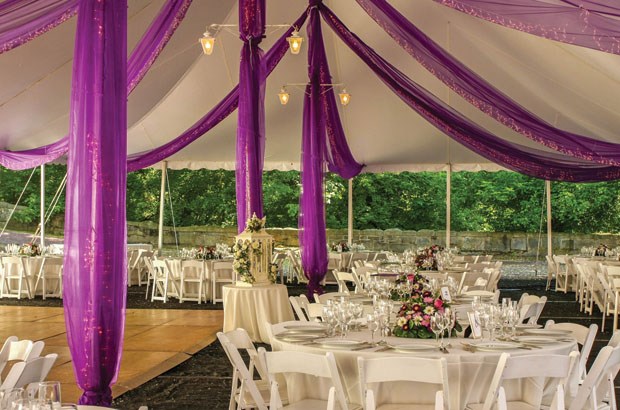
Colour can be a critical component when establishing the ambiance for a wedding. Colour can evoke certain moods and set the tone for the day. Some colours work better together than others, so while choosing a colour scheme may seem like an easy undertaking, some couples may find it requires more careful consideration than they first imagined.
According to the bridal guide A Practical Wedding, wedding colours can give couples a starting-off point for all of the other details of their weddings. This ensures the wedding ultimately has a cohesive look. Colours need not necessarily match, but borrowing on similar hues can make it easier to plan wedding party wardrobes, flowers, table linens and much more.
Colours can come from anywhere, but many couples try to coordinate their colour schemes with the season in which the wedding takes place. In fact, couples who are finding it difficult to decide on a palette can look to seasonal colours for inspiration. For example, pastels and blooming flowers can set the scene for spring weddings, while jewel tones and rich reds and greens may be fitting for winter ceremonies.
Some couples opt for more loosely defined colour palettes, such as neutral and natural colours. Country and garden weddings can borrow ideas from the landscape, with natural linens paired with wildflowers. Using whites, grays and beiges enable couples to add a pop of colour without overwhelming the setting.
Brides magazine suggests that couples avoid choosing too many colours. A maximum of three with one metallic can ensure things look cohesive without being over-the-top. Also, brides and grooms needn’t feel pressured by the “hot” colours of the moment.
As with clothing and hairstyles, trends change. It is better to select colours that will stand the test of time and look good for years to come.
Couples may have to incorporate colours already at their wedding venues into their style. Fortunately many reception sites are outfitted in neutral tones to enable customization.
The wedding resource The Knot also says having a basic knowledge of the colour wheel can help. Typically, colours that pair well together are those that are opposites on the colour wheel. Also, colours that share proximity on the colour wheel will have similar tones and play well together. Examples of opposite colours include purples and yellows, reds and greens, and oranges and blues.
Couples should not be afraid to take some chances with their colour palettes, especially if they want to make a bold and modern statement.