Rich floral colours are expected to be in full bloom - not only in the garden, but in all elements of home decor. That's the forecast of SICO paint in unveiling its top colours for spring and summer 2015.
Think deep pastel tones, such as blue hydrangeas, dusty pink roses, saturated orange and turquoise peonies, sunflowers, clay grey stones and reddish brown vines.
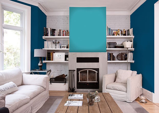
"This season's paint palette is filled with saturated colours, in both warm and cool tones," said Mylène Gévry, marketing manager for Sico paint. "It's all about bringing colours of the garden inside and using them in creative ways."
Topping Sico paint's list of hot colours for spring and summer are Impetuous Blue, Ningxia Pink, Dynastic Orange, Blueberry Flower, Dark Lemon, Cotton Flower,
Stainless Steel, Cayman Blue, Sargasso Sea and Aperitif.
"The back-to-basics, return-to-nature trend firmly planted in home decor the last couple of years is now moving away from neutral tones toward more colourful - while still soothing - elements of nature," Gévry said, crediting the fashion world for the infusion of rich tones into interior design.
"The fashion runways are filled with deep pastels, both on their own and in bold, oversized floral patterns that are trending right now," she said. "This rich, floral influence is spilling over into all facets of home decor, from fabric and furniture to drapery and accessories."
To incorporate this season's blossoming colours into your decor, Gévry recommends looking outdoors for inspiration:
Think about what colours in nature make you feel good.
What outdoor settings make you feel most relaxed or energized - your garden, the woods, the countryside or the sea? Narrowing the feeling you'd like to achieve, and the element of nature you'd like to replicate, makes it easier to choose colours.
Pick a main colour for your room and then add other hues in unequal amounts. A good rule of thumb is to use the dominant tone in about two-thirds of the room. For example, if you select a turquoise blue as the dominant colour, you may want to paint an accent wall a darker blue, and your trim, doors and ceilings in white, cream or a lighter shade of one of the blue colours.
When developing a colour scheme, consider the "temperature" you want to create indoors. Yellows, oranges and pinks are warm colours, whereas blues and greens are cool tones - something to bear in mind if you're looking to warm up a room on the shady side of the house or cool off an area with southern exposure.


